
FAIRBORN — The City of Fairborn is making efforts to change its image, beginning with its brand. Changes will include the city logo and tag line.
City officials began this project last year and are hoping to make some decisions before the presidential debate occurs and water tower visible from Interstate-675 is painted. Changes are targeted to include exchanging its logo from its current design to a new one and incorporating a new tag line.
The total cost for the changeover is unknown at this point. Citizens could see completely implementing the new brand taking place in years to come.
The project started designating individuals from city entities such as churches, the school district, chamber of commerce, finance department and city manager’s office to work with a firm. The idea was to choose individuals who reflected on Fairborn and what they would like the city to become in the future.
“With all the changes we’re trying to make in Fairborn, all the discussions we’ve had in the last few weeks about our issues, many of them have been longstanding, or we have the issues because of our past,” Councilwoman Marilyn McCauley said. “I think we all want to take on a new face — we’re going to have to if we survive. I think our current logo looks very tired and if we don’t change all aspects of our city to get a new, fresh start, then I think we’ve missed the boat. It’s not just a picture we’re talking about here, it’s a whole change of attitude.”
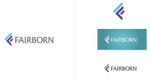
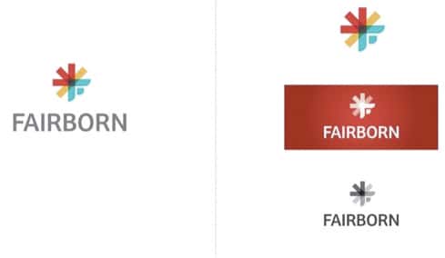
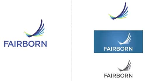
The project began with nine concepts, but narrowed it down to three logo and three tag line options, respectively. The firm additionally reached out to the local Rotary Club and sent out approximately 400 email surveys, which received a 25 percent response rate, who each voted for their favorite logos; officials from the firm said it was surprised to see each group select the same logo.
“I love our [current] logo, I think it’s beautiful,” Fairborn City Manager Deborah McDonnell said. “But I’m not sure it represents who we want to be later and who we aspire to be … We want something that represents us in a new light, to new businesses and residents.”
The logos included designs that could be interpreted to look like wings. Upon discussion, officials concluded that flight and innovation was an important aspect to the city and they hoped to convey that in the new brand. The three tag lines are: “born for greatness,” “in flight” and “soaring toward aspirations.”
City staff and council discussed the brand during a work session Monday, Jan. 11, but did not take a vote. Instead, they discussed the brand, inviting Fairborn Area Chamber of Commerce Director Paul Newman Jr. to participate, and aimed to reach a consensus. Members expressed their concerns, some revolving around costs and others fearing Fairborn losing its tradition or “hometown” feeling, but most felt the need for a change.
The next steps include holding meetings to develop a tag line and guideline documents for the selected logo. Upon making all of these decisions, the city will begin to incorporate the logo onto its materials.
“We’re taking huge steps to advance our position in this community, in the Miami Valley, and to be different than we’ve been in the past — how do we do that with a brand?” McDonnell said. “A brand is significantly more than a logo; that’s one piece, the visual quickie. So if we try to change the brand and sell ourselves as something different than what we were yesterday, but keep the same logo, will our challenge be greater to tell people that we’re different?”


